Overview
Building an All-in-One App that Streamlines Claimant Data Retrieval, Reducing Time, Resources, and Complexity
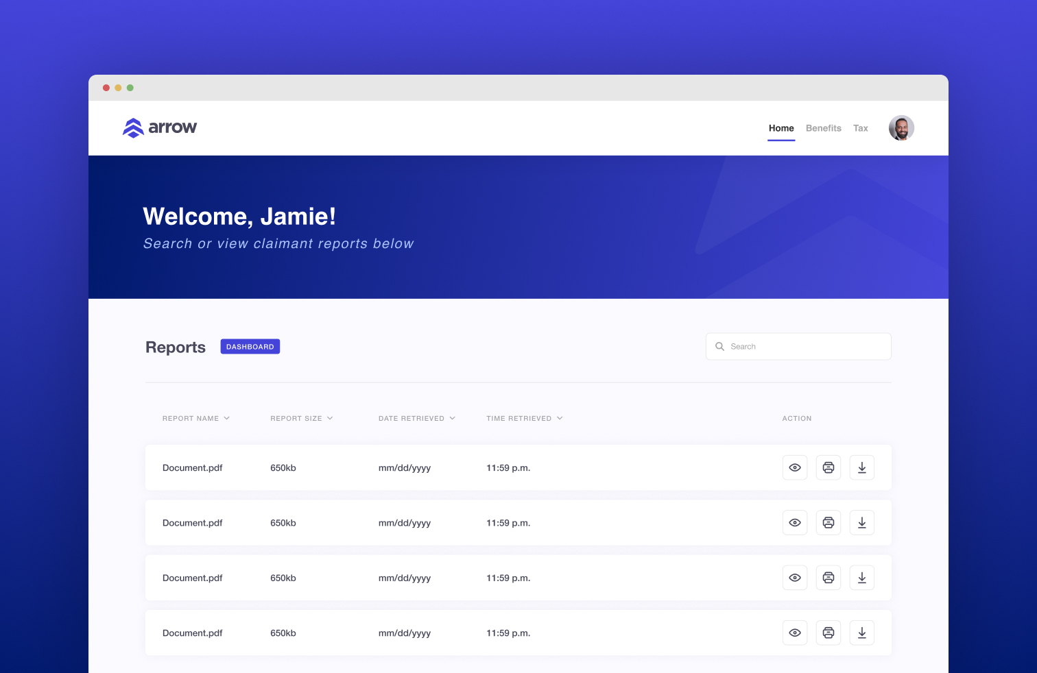
ARROW is an application built to easily search, retrieve, and compile Kentucky Unemployment Insurance claimant data from various databases. The application is currently utilized by The Office of Unemployment Insurance (OUI) Benefits and Tax branches and will be utilized by other states to help them decrease time spent on retrieving claimant data, create a singular platform to get the required data, and ultimately cut down on additional resources needed to perform job tasks.
Timeline
3 Months
Platform
Internal Application
My Role
Lead UI/UX Designer
Lead Graphic Designer
Front-End Developer
My Role
For this project, I worked as the Lead UX Designer and helped with front-end development to build the interface based on user research and feedback including surveys, usability testing, and more. I worked with Project Managers, Business Analysts, and Developers to deliver the final product.
Problem Statement
Retrieval of Claimant Data is Inefficient, Unintuitive, and Cumbersome due to Lack of Functionality
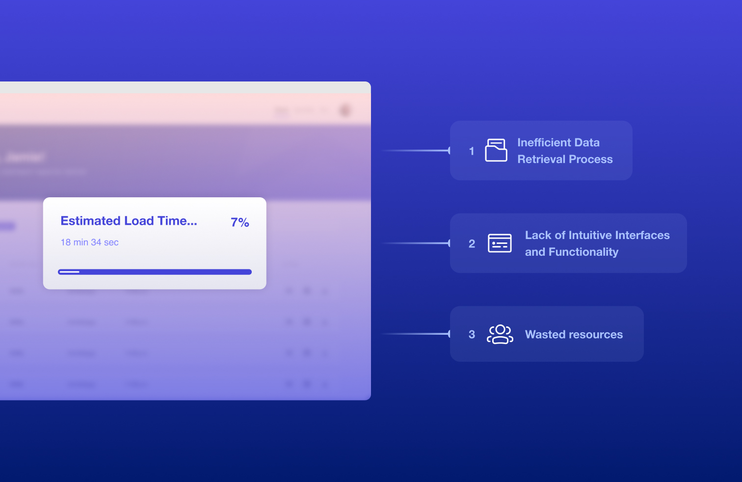
Inefficient Data Retrieval Process
The current claimant data retrieval process takes users a reported 15-20 minutes on average to access, find, retrieve, compile, and save any necessary documentation.
Lack of Intuitive Interfaces and Functionality
Users expressed that the various database interfaces they’d interact with were difficult to navigate and didn’t offer a straightforward way to retrieve the necessary data/information.
Wasted resources
Oftentimes, employees would deploy other employees who were working jointly with them to retrieve all or some of the data they needed. This doubled the workforce needed to complete the tasks and wasted valuable resources and time.
Goals
Streamline Claimant Data Retrieval with a User-Friendly, All-in-One Solution
Develop a user-friendly application as a one-stop shop for existing users to retrieve claimant data efficiently. The application should decrease load times and be easily accessible for existing and new employees.
Decrease Load and Data Retrieval Times
Optimize workflows and minimize steps to retrieve data by utilizing clear navigation and filtering options.
Develop an All-In-One Application for User Needs
Consolidate fragmented tools into a single platform that provides all necessary features for seamless data retrieval and management.
Create a Better, User-Friendly Experience
Redesign interfaces to be intuitive and accessible, reducing the learning curve for new users and improving usability for existing ones.
The Results
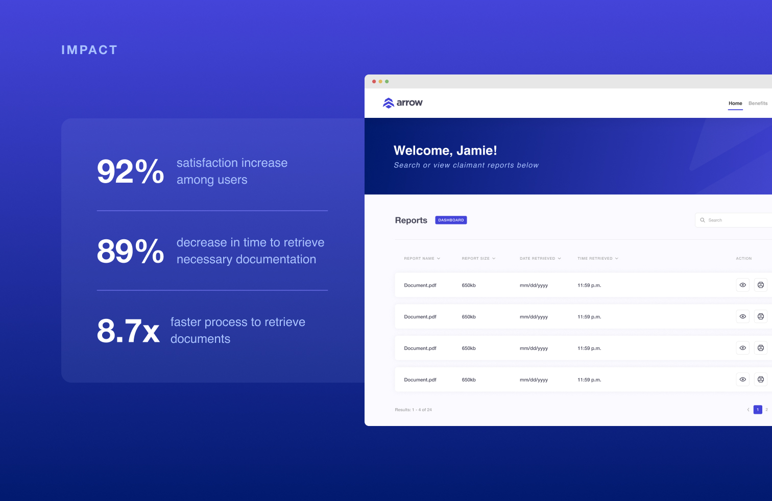
89% Faster Data Retrieval, Saving Time, Resources, and Headaches
After launching the application, the process to obtain and compile claimant data was reduced to under two minutes on average depending on the amount of data compiled. This accounted for an 89% decrease in the process allowing staff to put the saved time toward other duties, saving not only time but staff intervention and resources.
Research
Unveiling Valuable Insights Through Research Methodologies
Utilizing various research methods, including stakeholder interviews, surveys, and more, I was able to identify key insights and pain points to inform my design decisions.
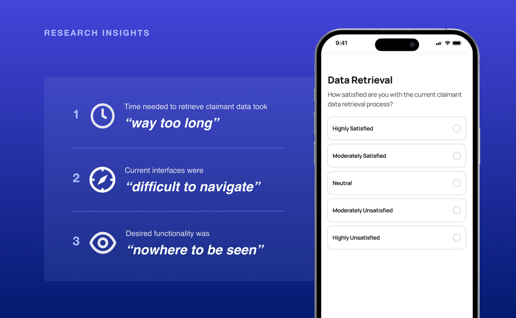
Retrieval of Claimant Data was Time-Consuming
The standard time to retrieve data took anywhere between 15 to 20 minutes for multiple staff to manually retrieve wasting valuable time and resources.
Current Interfaces Are Difficult to Navigate
To retrieve claimant data, staff have to navigate through multiple apps that are unintuitive and have lengthy or cumbersome processes.
Desired Functionality is Nowhere to be Seen
Staff expressed the desire to have specific functionality to better filter, sort, and compile the data so they wouldn’t have to do it manually and expend valuable time and resources.
Design Process
From Simple Concepts to Building a Final Product that Delivers Results
From sketching concepts to delivering the final design, the design process consisted of extensive trial and error, presenting concepts and solutions based on our user’s needs and frustrations. Continuous research and implementation of feedback allowed us to iterate and deliver a final design that made an immediate impact.
Identifying Design Principles
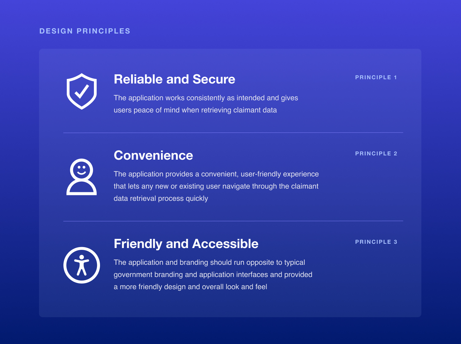
We started by defining 3 design principles based on our users' pain points and what they valued in their ideal application.
Brand Development
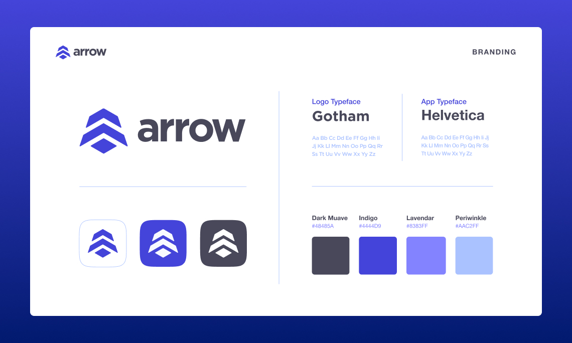
After the design principles were established, we started developing the branding for the application including the name, logo, color palette, typography, and more built around the design principles and our insights.
User Flows
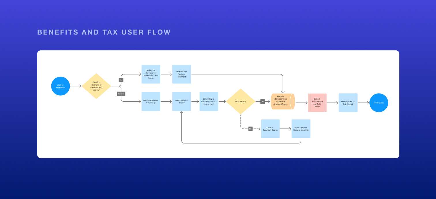
After understanding the desired functionality of the users, I developed user flows for the login process and claimant retrieval process for both the Benefits and Tax branches of OUI since they had differing needs.
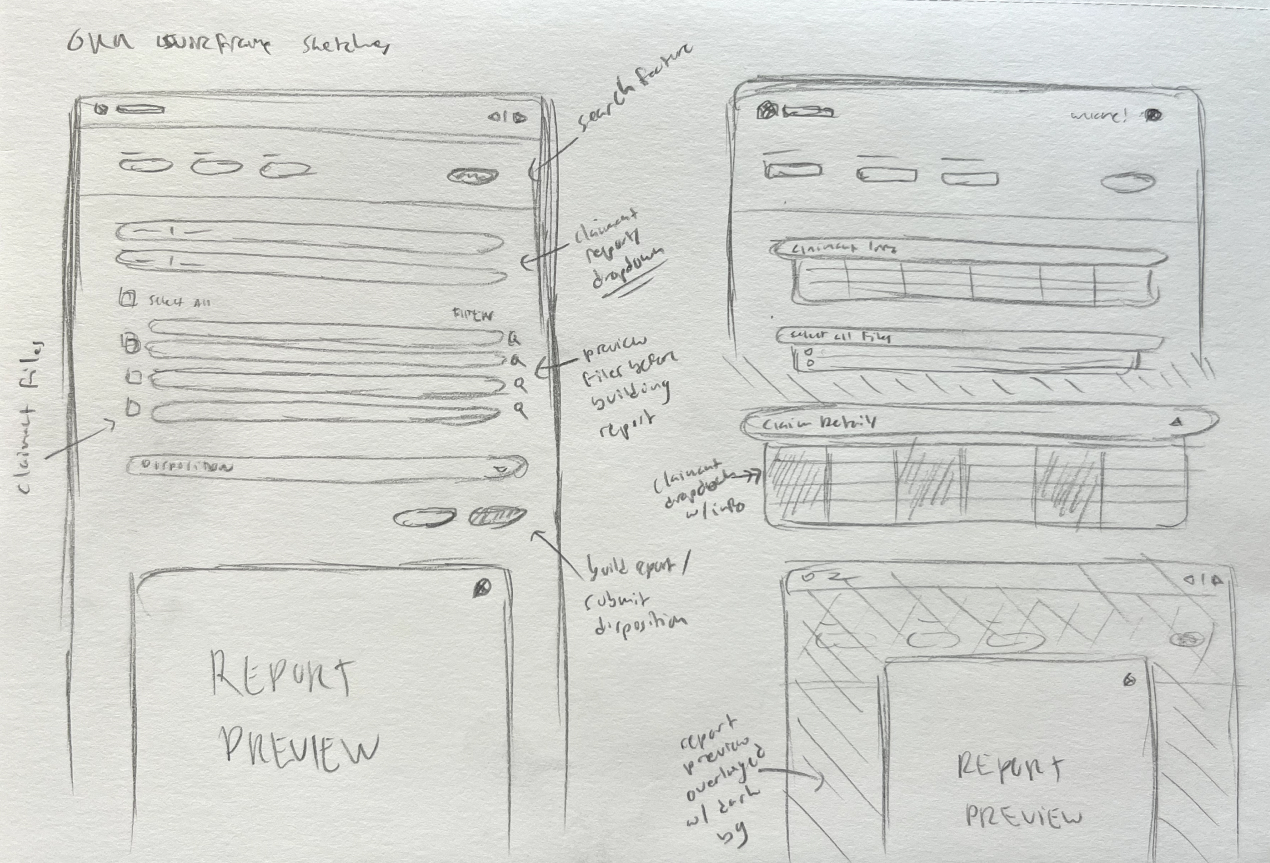
Sketching and Wireframing
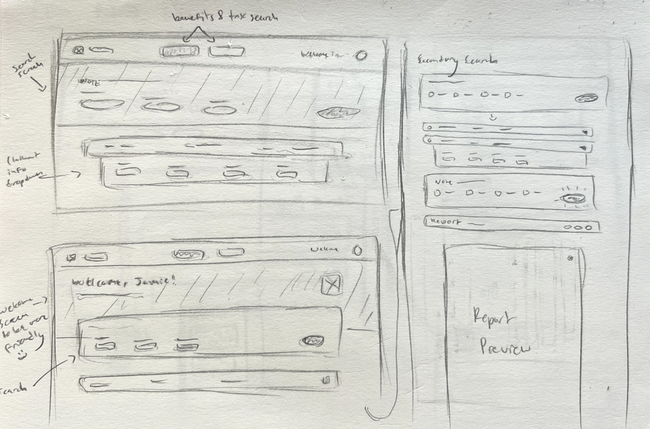
Once the branding and user flows were approved and finalized, I started on sketching out wireframes for potential layouts based on the first iteration of user needs. This allowed me to get all the good, bad, and ugly ideas out on the page.
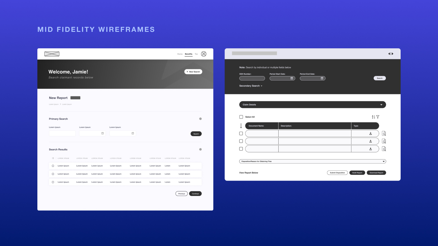
Mid-Fidelity Wireframes
These sketches led me to develop the first iterations of mid-fidelity wireframes which were iterated on, approved, and turned into high-fidelity wireframes. Exciting!
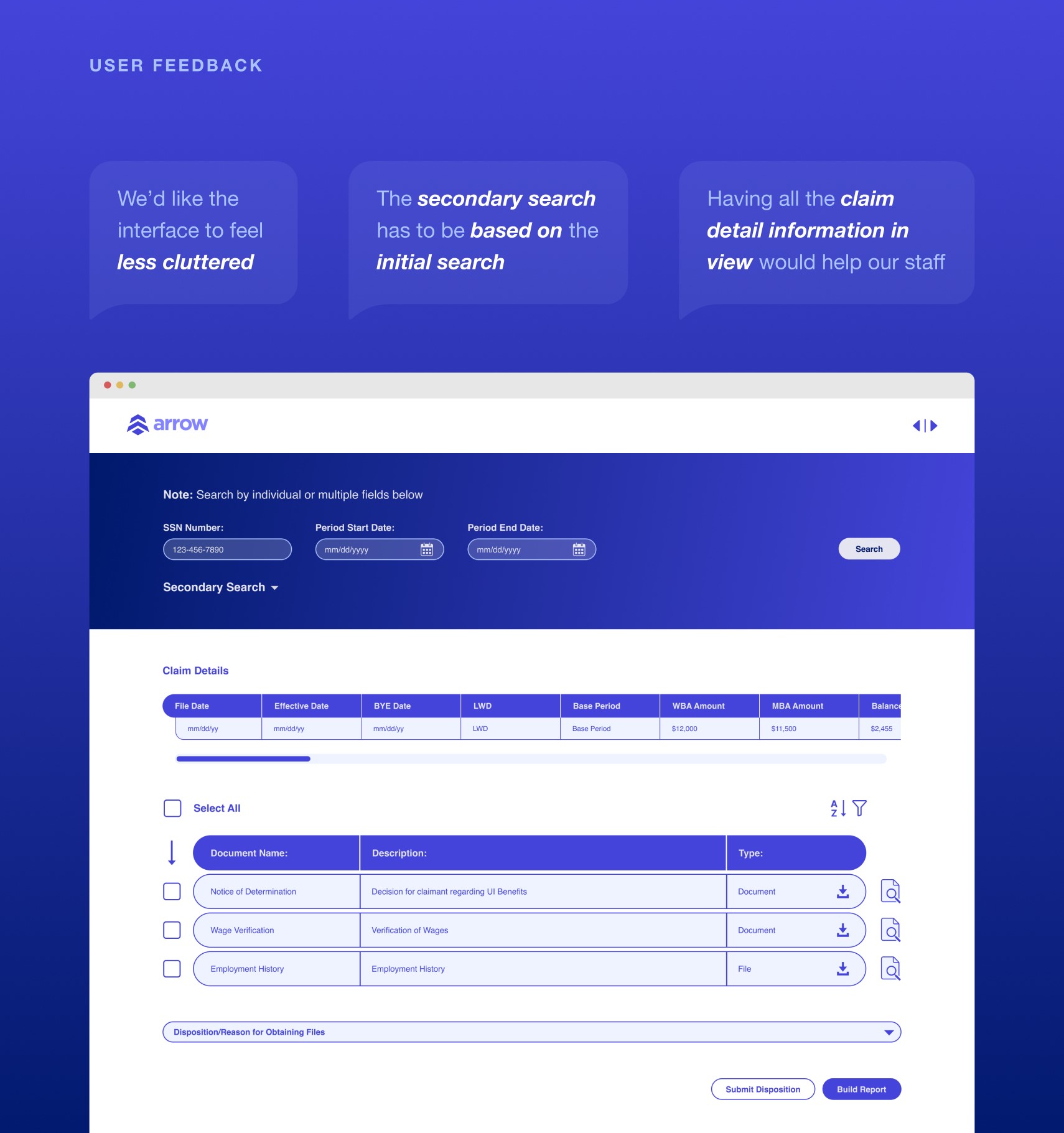
Implementing User Feedback
After experimenting and presenting our high-fidelity designs, we received feedback on the overall design and desired functionality from users. This allowed us to rethink our process and revise the design and user flows based on new requirements.
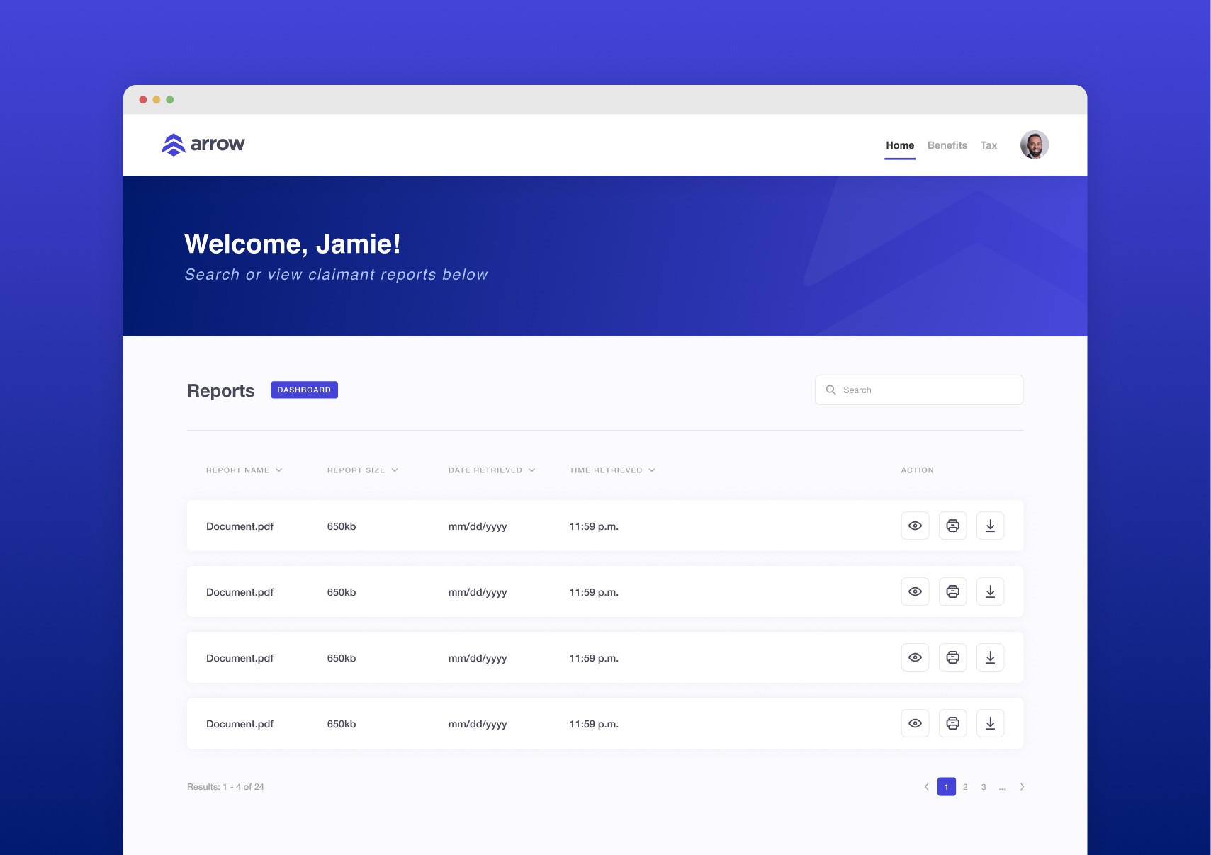
The Final Product
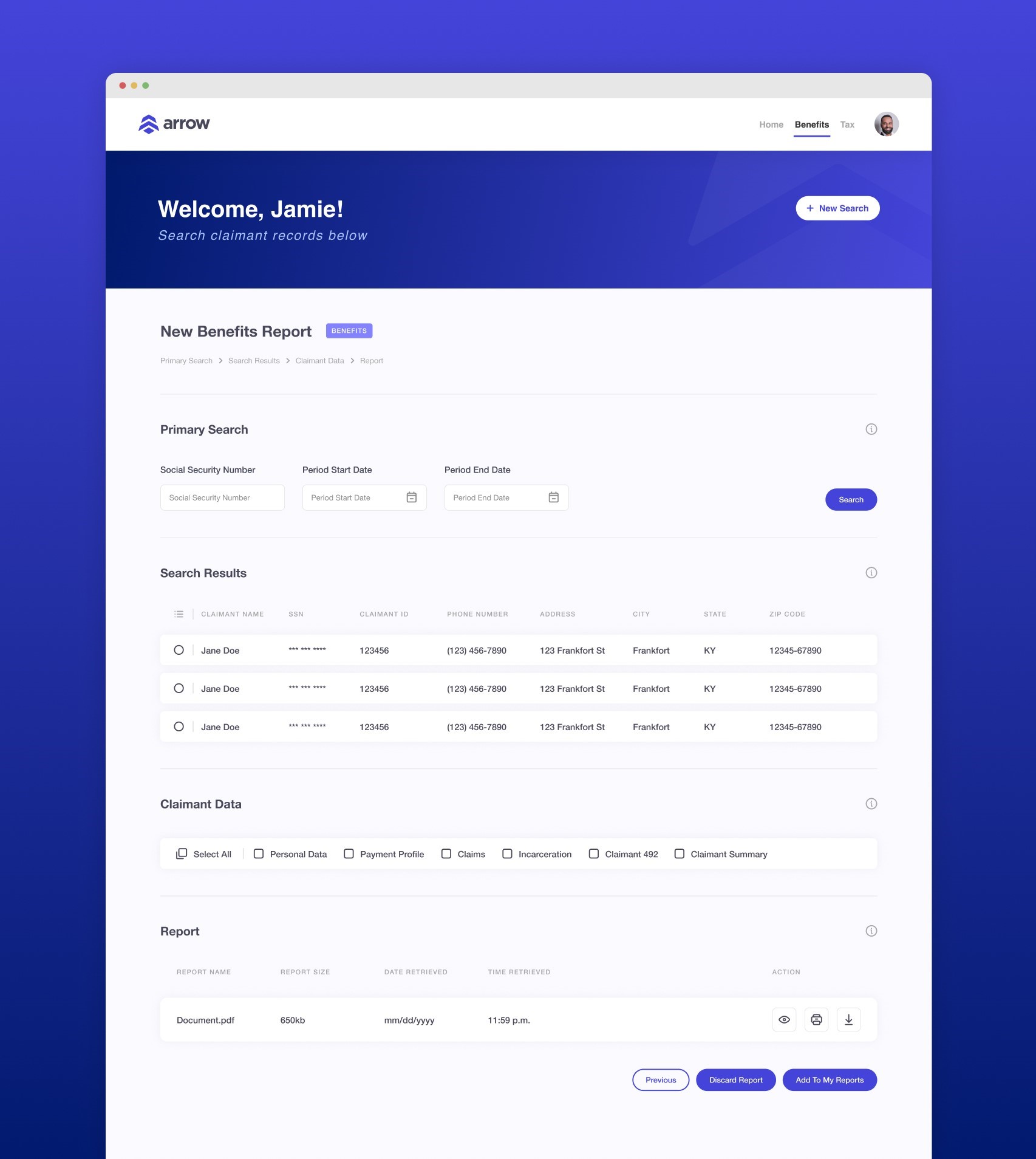
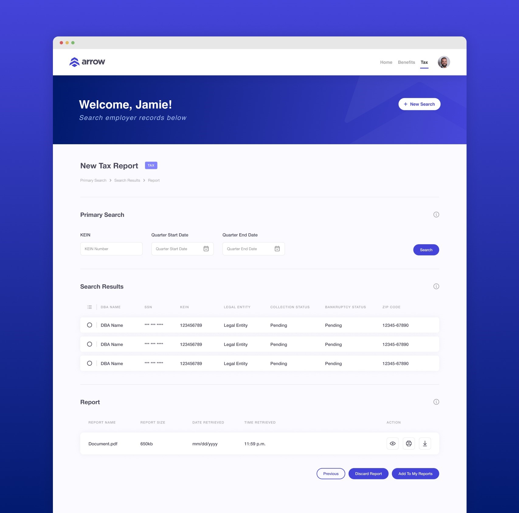
Arrow’s Final, Streamlined, All-In-One Application
After multiple rounds of revisions and additional user research, we landed on the final design below that captured all the needs of our users from the Benefits and Tax branches.
Future Steps
Continued Improvement and Deployment of the Application
Continue Development
Continue to discuss user needs and update the design and functionality when and if new needs arise.
Deploy ARROW to other states
Hand off the application to other states so it can be integrated with their databases and user needs.
Conduct Ongoing Usability Testing
Periodically test the application with both new and experienced users to uncover pain points and assess how updates affect usability.
Reflection
Looking Back on What Could’ve Been Improved
While this project yielded great results, there are a few things I would have done differently if I could start again.
Defining All Use Cases
After we started designing, it became apparent from staff that their process and use cases didn’t all line up. While we were able to adapt and re-design to fit every users needs, it would’ve saved valuable time and resources to do more thorough research to ensure every users needs were being met.
Prepping for Regional Adaptations
While this application can be adopted by other states, we didn’t have the time or budget to consider other states direct use cases for this. If permitted, I would’ve looped other key state stakeholders to get a bigger picture of how we could make the application functional and optimal for everyone.
Developer Involvement
Involving developers sooner in the process to ensure everyone is on the same page and ensure we didn’t have any limitations when it came to the design or functionality would’ve saved some hassle.
