Overview
Modernizing an Application to Investigate Fraudulent Activities more Efficiently
The Labor Law Pro (LLP) application focused on modernizing an outdated government application for Kentucky’s Education and Labor Cabinet (ELC) used to investigate companies illegally reporting employee wages and hours. The final product created a more intuitive, efficient, and accessible tool for government staff, saving time, resources, and costs to complete investigations.
Timeline
4.5 Months
Platform
Internal Application
My Role
Lead Product Designer
Lead Graphic Designer
My Role
I worked as the lead UX Designer, and Graphic Designer to create the branding, design system, and user interface of the LLP application. I worked with Business Analysts, Project Managers, and Developers to research, conceptualize, design, and deliver the final product.
Problem Statement
The Current Application Has Limited Functionality, Accessibility Issues, and is Unengaging
Staff investigating illegal wage and hour reporting are hindered by an outdated, visually unappealing, and poorly accessible application that lacks critical functionality. This limits their ability to investigate and act on cases efficiently, resulting in unnecessary time spent on tasks, delays in enforcement actions, and additional resources and costs.
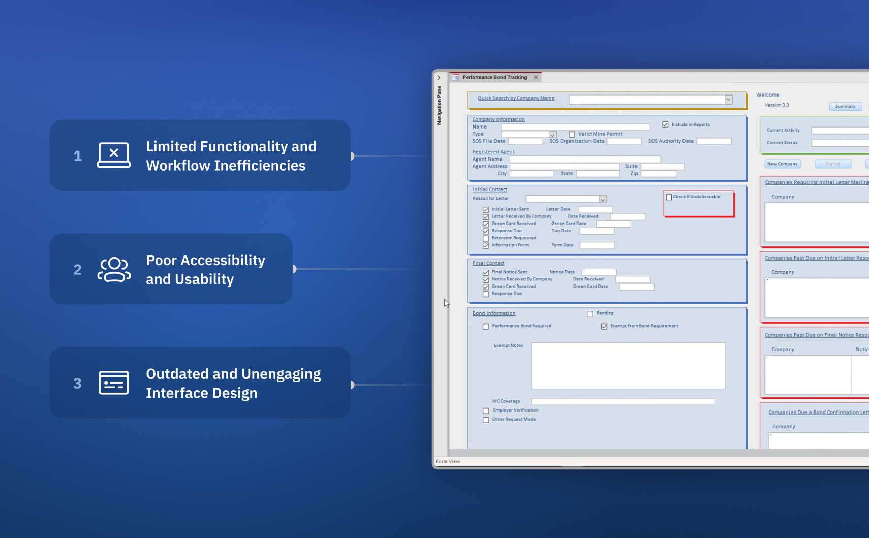
Limited Functionality and Workflow Inefficiencies
The application lacks essential features like generating forms or having a document library required for thorough investigations. This forced staff to rely on manual workarounds or supplementary tools leading to inefficiencies and an increase in the time and effort needed to complete investigations.
Poor Accessibility and Usability
Investigators relied on two separate applications with a difficult sign-up and validation process creating barriers for staff who need quick, reliable access to conduct investigations. We also found that the main application did not meet WCAG accessibility standards, hindering our investigators, reducing productivity, and increasing incomplete or delayed investigations.
Outdated and Unengaging Interface Design
The bland, outdated design of the interface lacks visual hierarchy and a guided user flow, making it challenging for users to navigate and prioritize tasks effectively. This results in a poor user experience that decreases job satisfaction and contributes to a lower adoption of the tool.
Goals
Modernize and Enhance the Usability of the Application
This project aims to modernize and enhance the usability of the government’s application for investigating wage and hour violations. By improving the application's interface, adding essential investigative functionalities, and enhancing accessibility and ease of use, we aim to enable staff to conduct investigations more efficiently and effectively.
Improve Workflow Efficiency
Reduce the time required for routine tasks and increase the efficiency of investigations through workflow optimizations and automation.
Add Essential Functionalities
Integrate critical investigative tools and reporting features to streamline casework and reduce reliance on external resources.
Enhance Accessibility
Ensure the platform meets accessibility standards, enabling all staff to work efficiently and without barriers.
The Solutions
Crafting Designs Around Our User’s Needs
Each design solution is created and informed by our research, defined problem statement, and the business and user goals. Here are a couple of ways we addressed our user's pain points and our end goals.
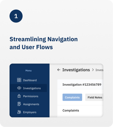
Streamlining Navigation and User Flows
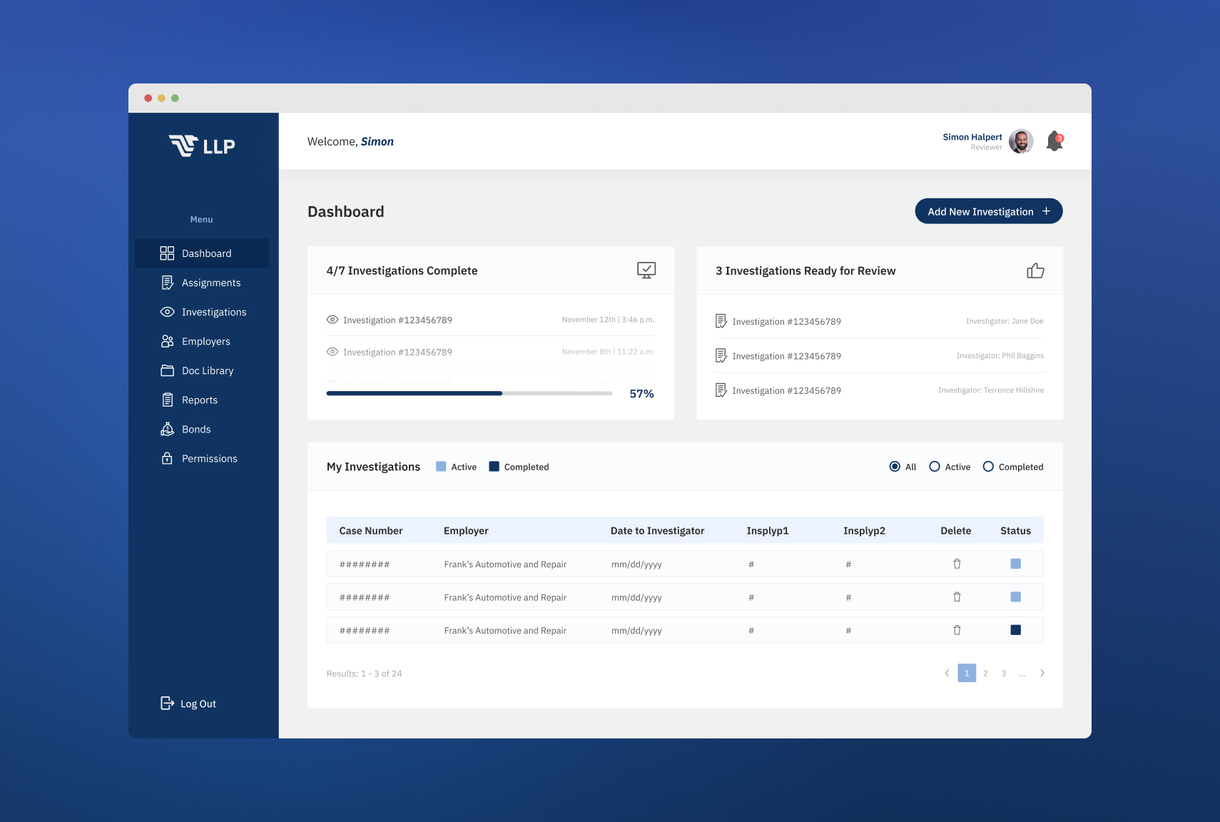
Inclusion of streamlined navigation with simple identifiers, iconography, and hierarchy to guide users through their workflow efficiently and effectively.
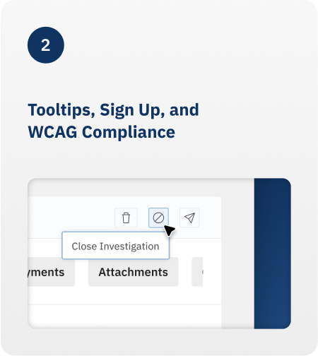
Tooltips, Sign Up, and WCAG Compliance
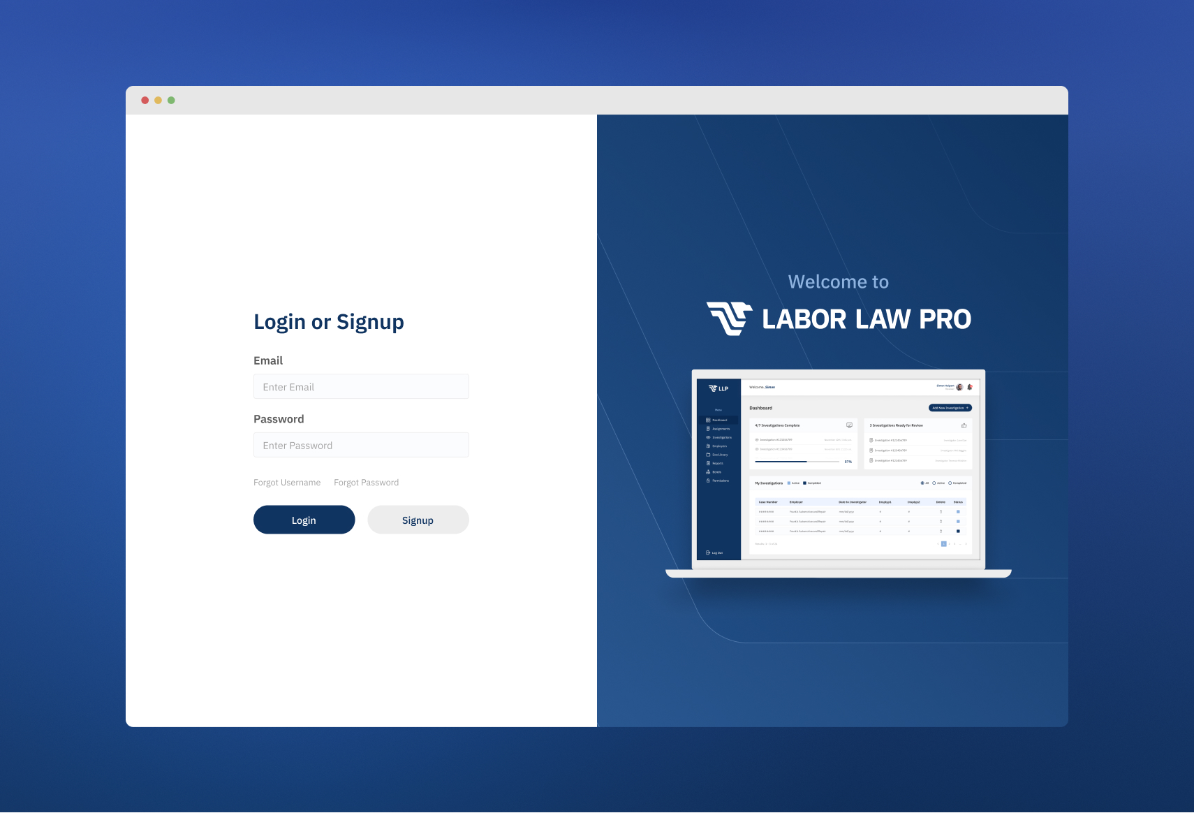
The inclusion of tooltips, a one-time sign-up process, and the creation of a design system that is WCAG-compliant made our application more accessible than ever.
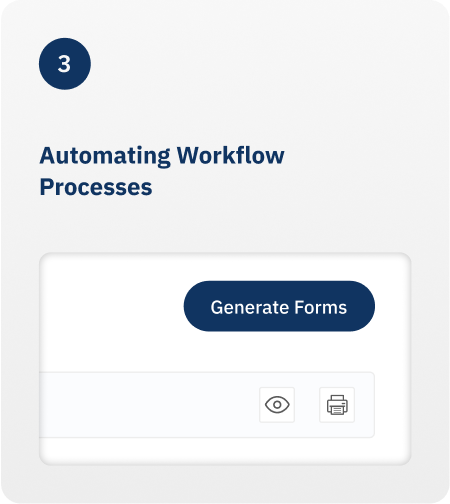
Automating Workflow Processes
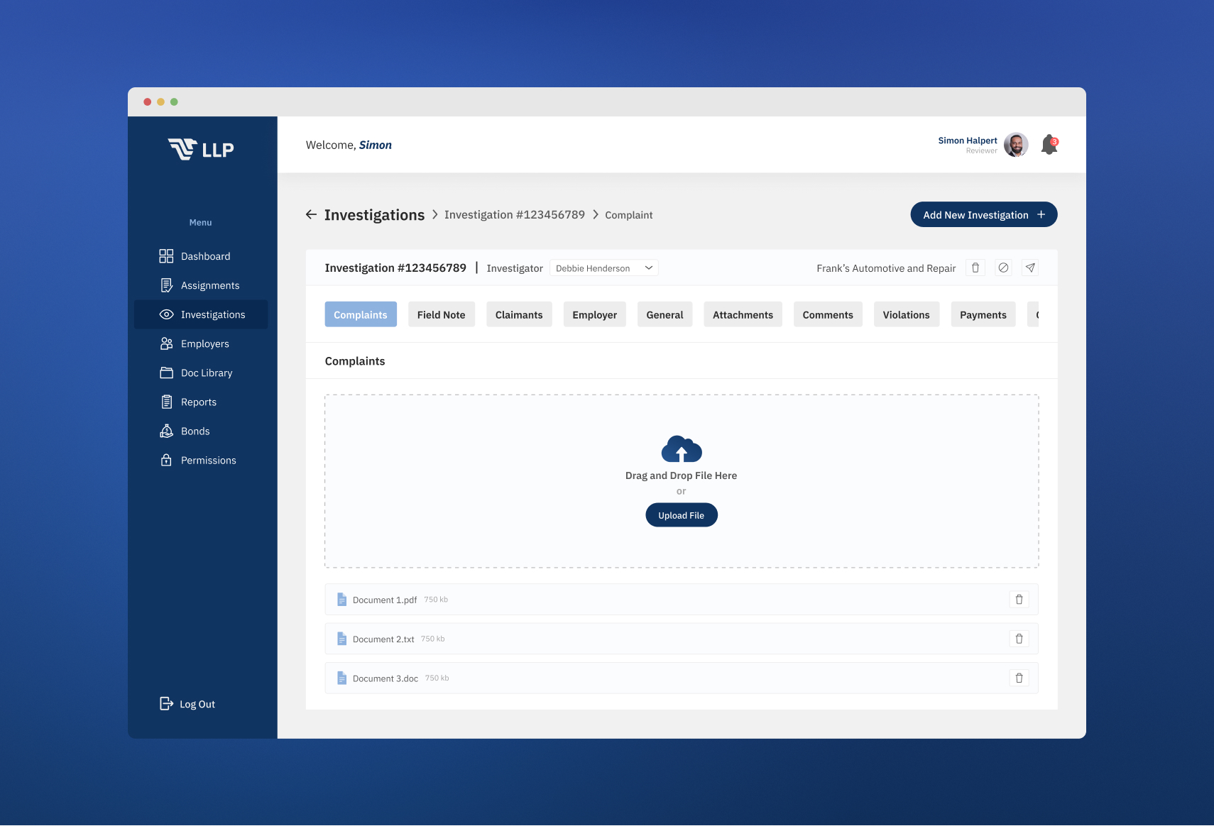
Allowing users to quickly access, complete, and generate forms based on their completed investigation.
The Results
Creating Lasting Impressions Through Increased User Satisfaction and More Efficient Workflows
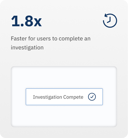
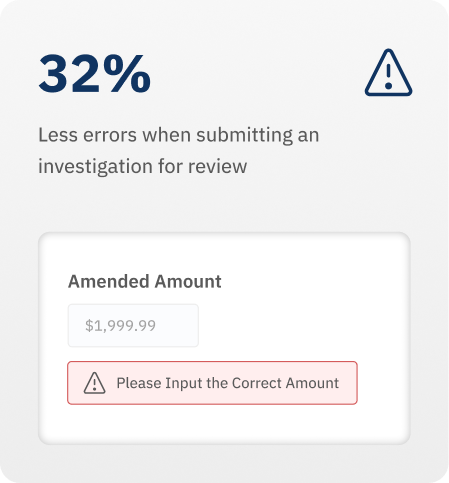
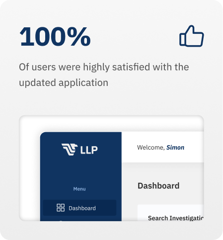
After deployment, we saw immediate results amongst our users. Investigations were completed 1.8x faster, had 32% fewer errors, and 100% of our users were highly satisfied with the new application.
research
Understanding and Improving User Experience Based on Key Insights
I conducted stakeholder interviews, surveys, and usability tests that revealed frustrations with the current application's lack of functionality, clunky navigation, and poor design. These research methodologies allowed me to get a better insight into the user's pain points, workflows, and needs, allowing me to make informed design decisions down the road.
Emotional Impact and Usability Issues
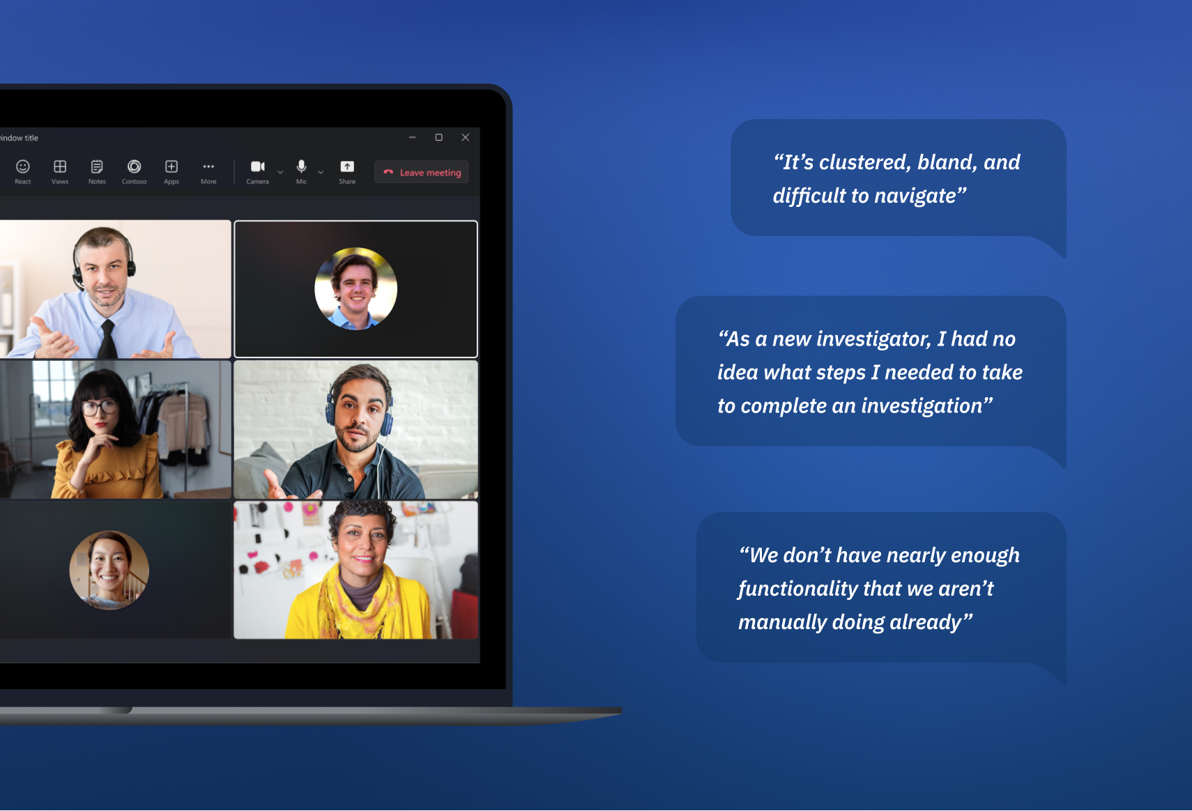
Users found the current application clustered, bland, and difficult to navigate. They explained that it felt like a lengthy chore to get their typical process done due to the user interface.
Workflow and Usage Patterns
Instead of going in a streamlined step-by-step process to review and complete an investigation, users would jump from various sections leaving blank information as they went.
Missing Functionality
Users found the current application did not have the functionality that enabled them to complete investigations efficiently. Instead, they relied on manual workarounds that cost them time and resources.
Design Process
How We Improve Through Deliberate Design Decisions
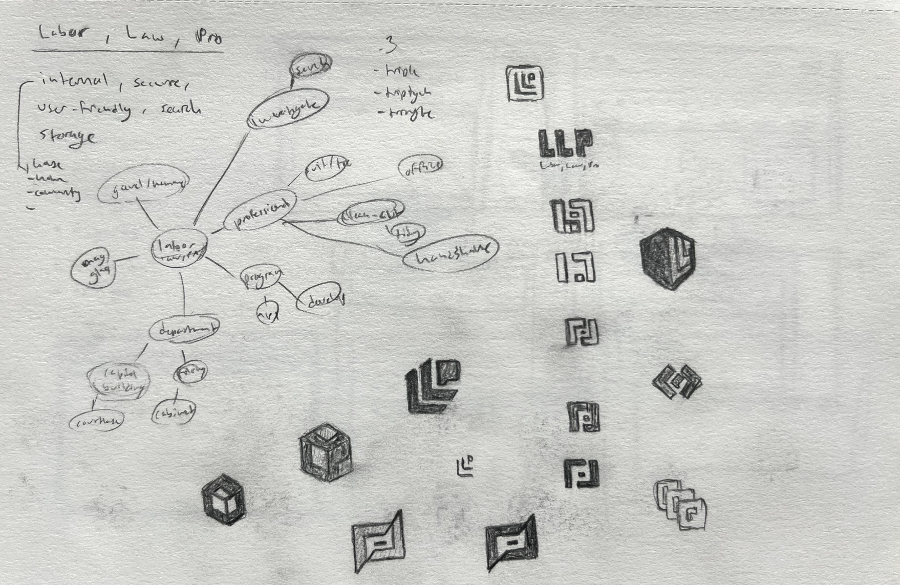
The first step was to create a new brand for the application that was relevant to the application's purpose while also meeting the desires of our users. After various concepts, color testing, and typography exploration, we narrowed down the logo and initial branding to two concepts.
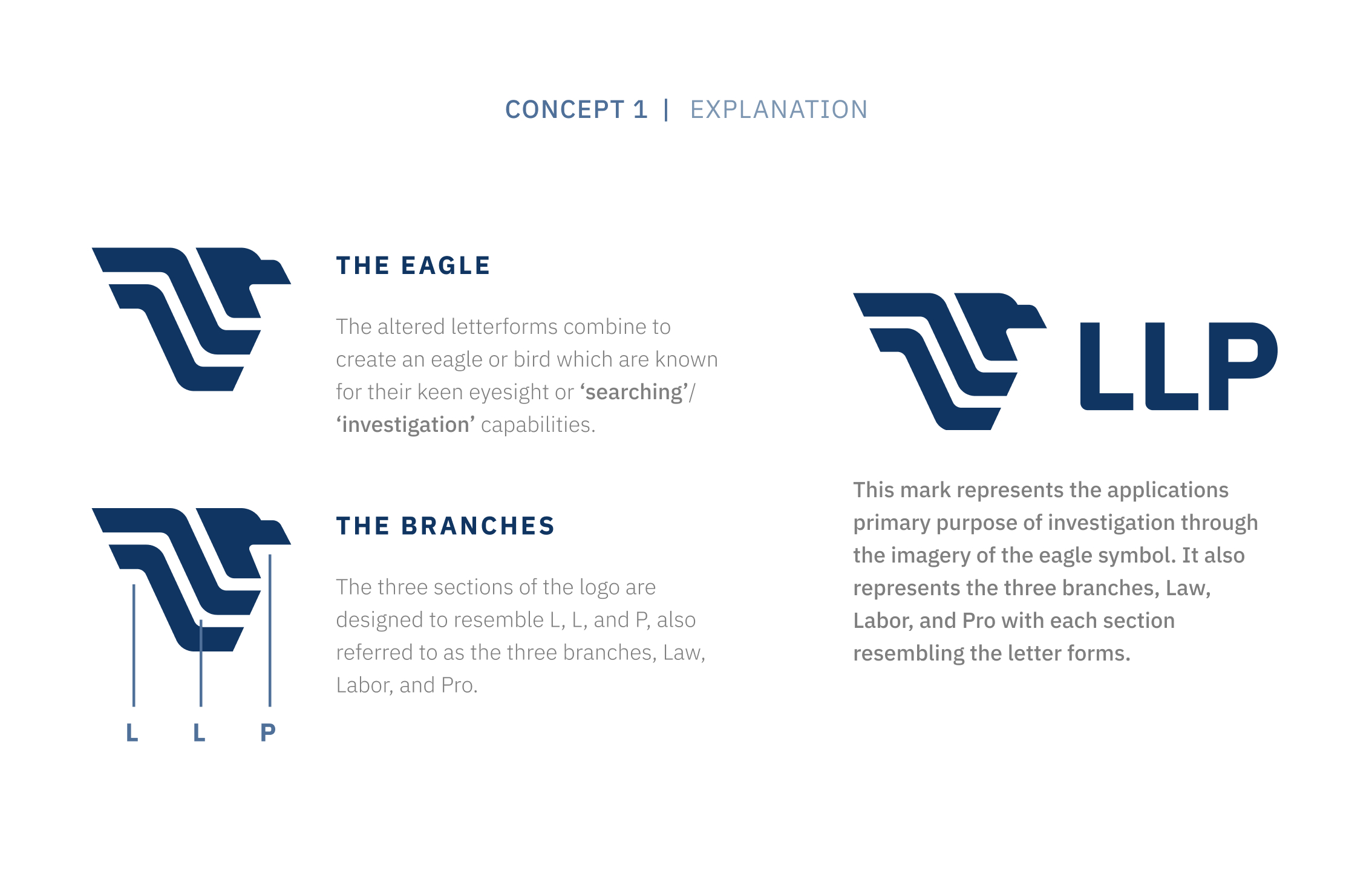
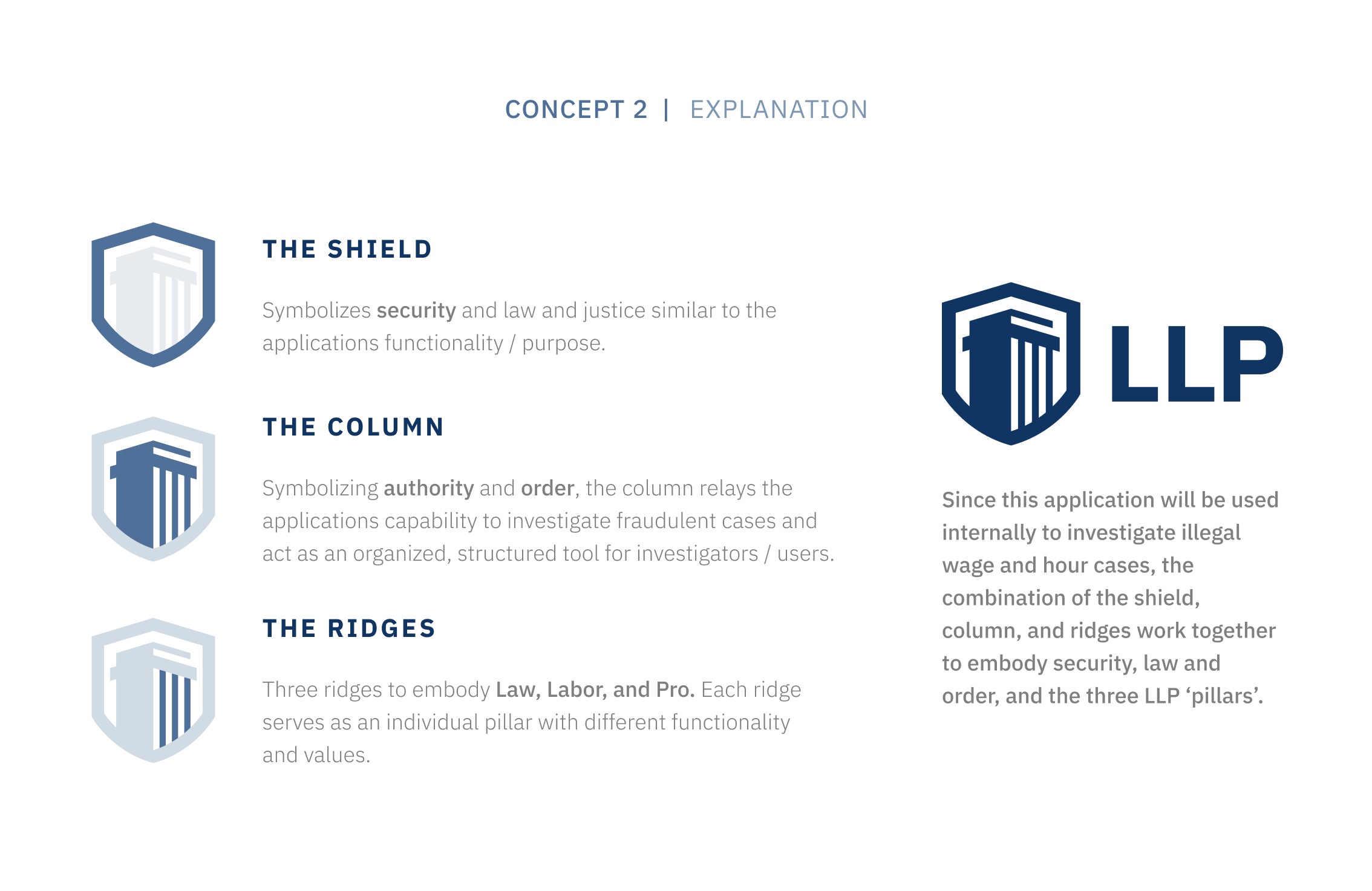
LLP’s New Brand
Concept 1 (my personal favorite) was chosen and would eventually have its very own design system based on the established branding. Here’s where everything really started to unfold!
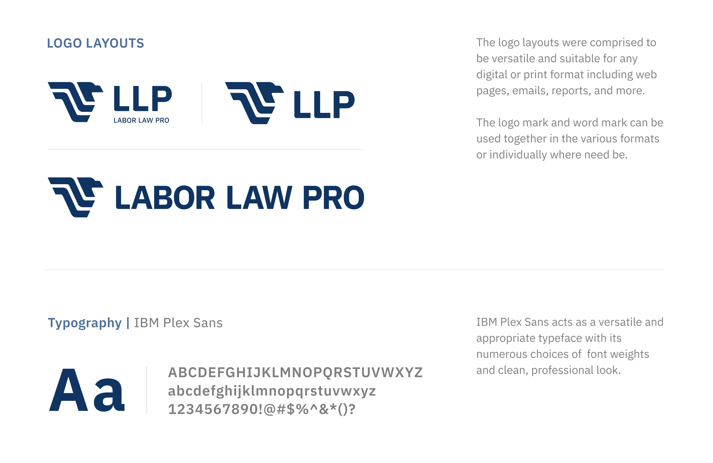
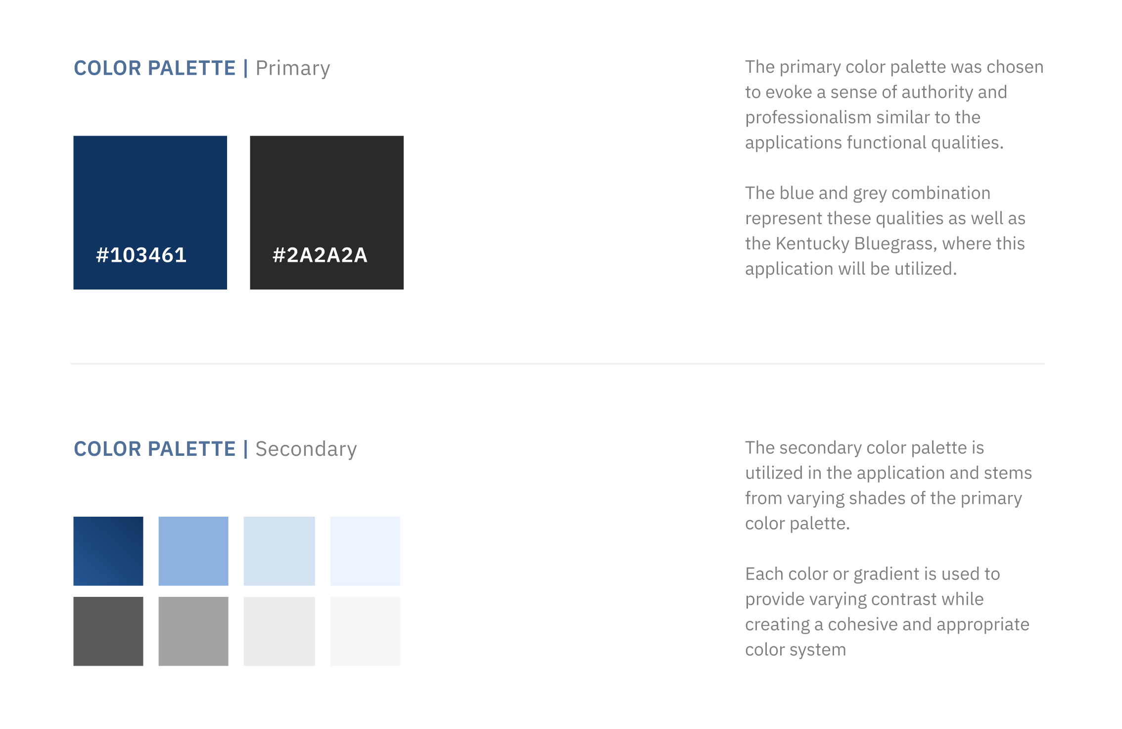
User Flow Development
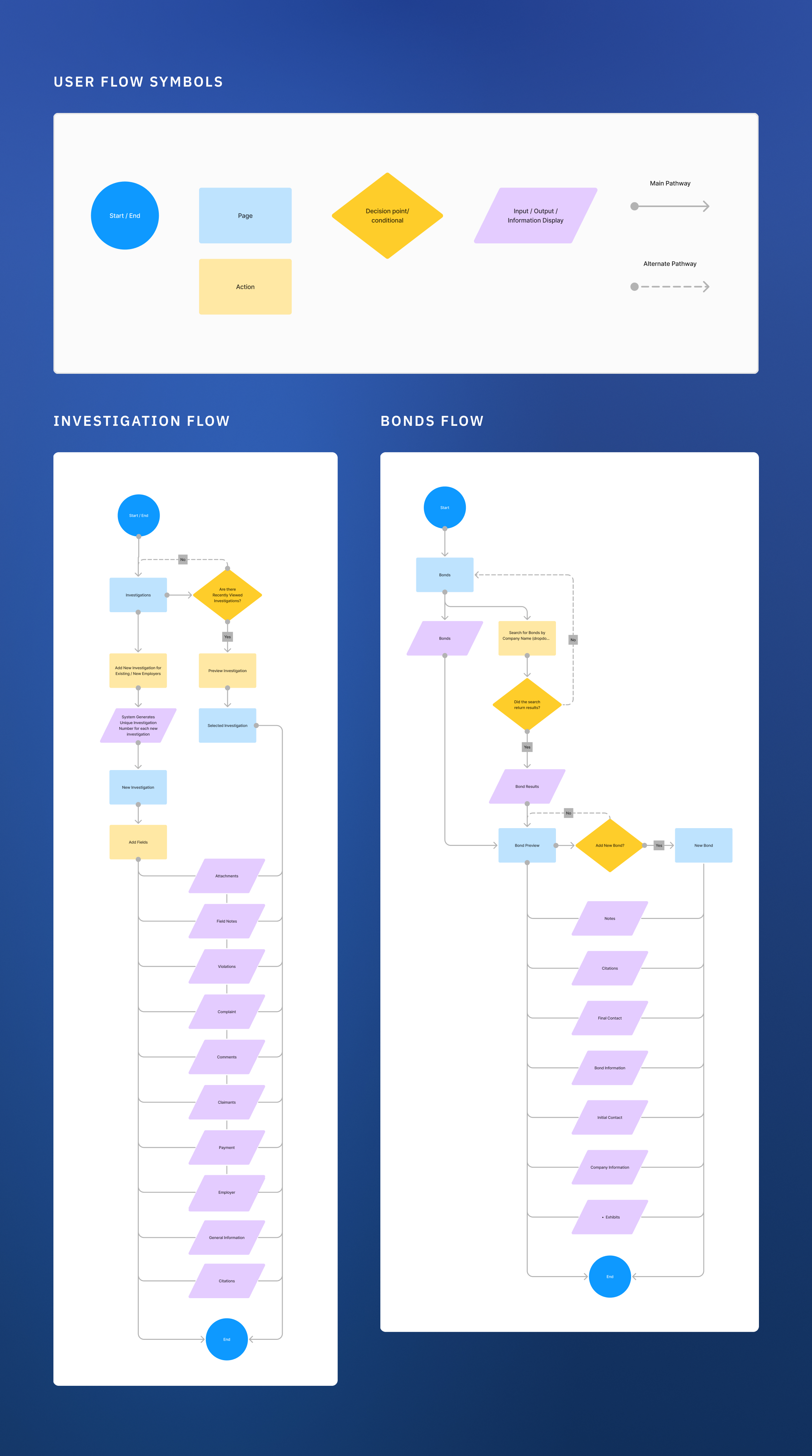
After understanding our users' needs, I developed user flows that prioritized ease of navigation, accessibility, and inclusion of the desired functionality. After presenting the user flows and gathering feedback from our users, I refined, iterated, and finalized the user flows to ensure the team was all on the same page. View two of the many user flows below.
Sketching, Iterating, and Wire-Framing
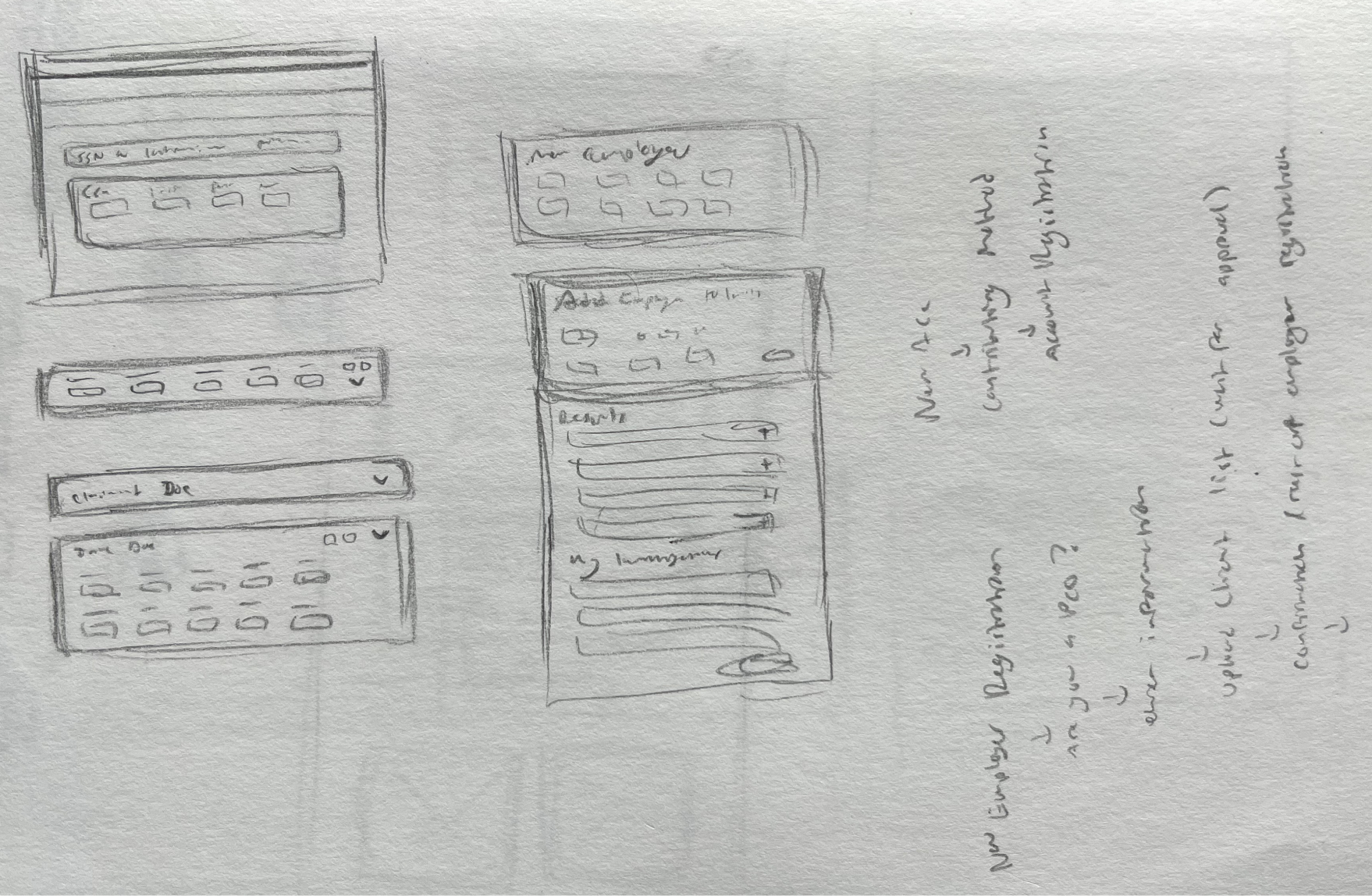
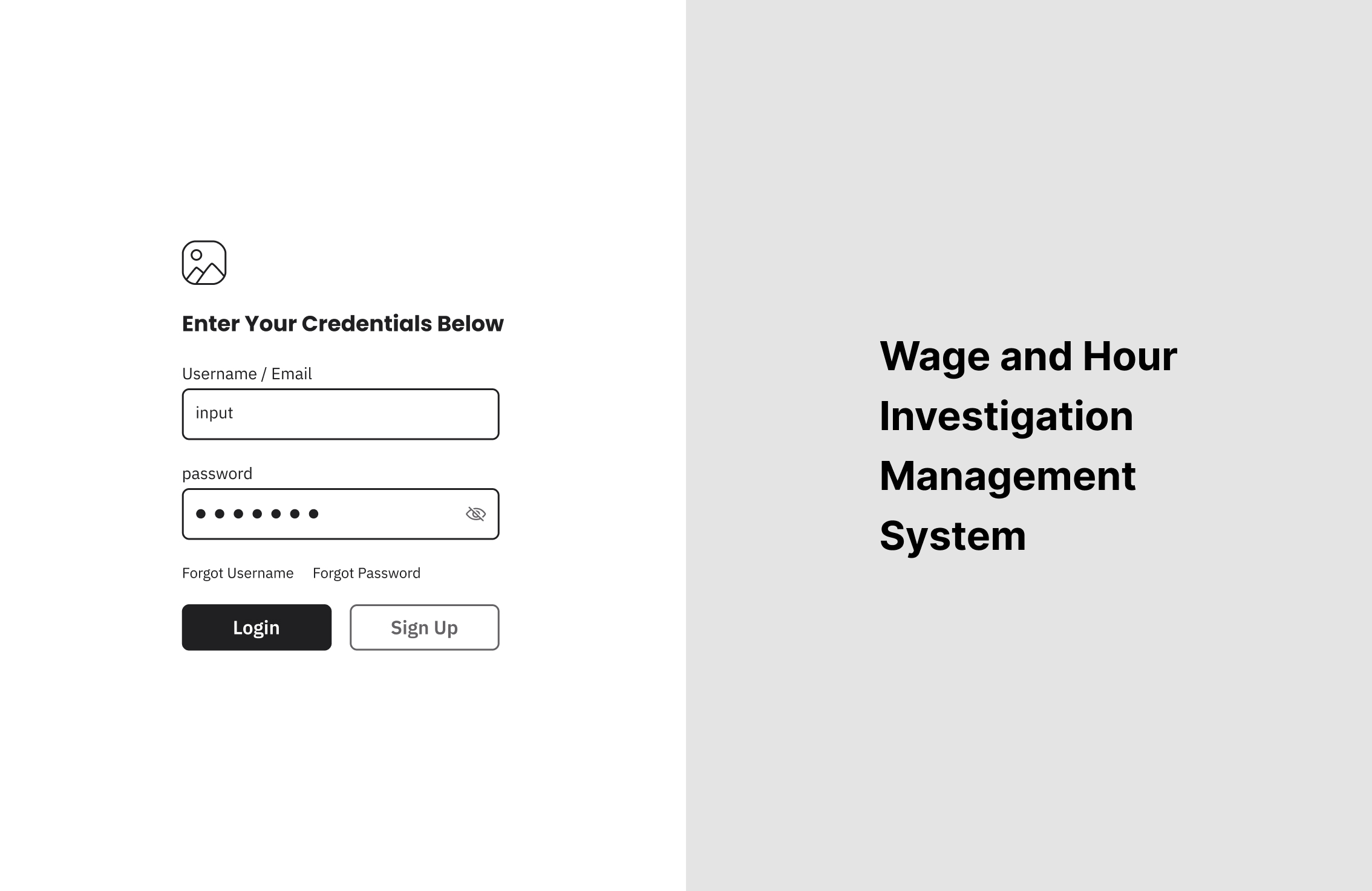
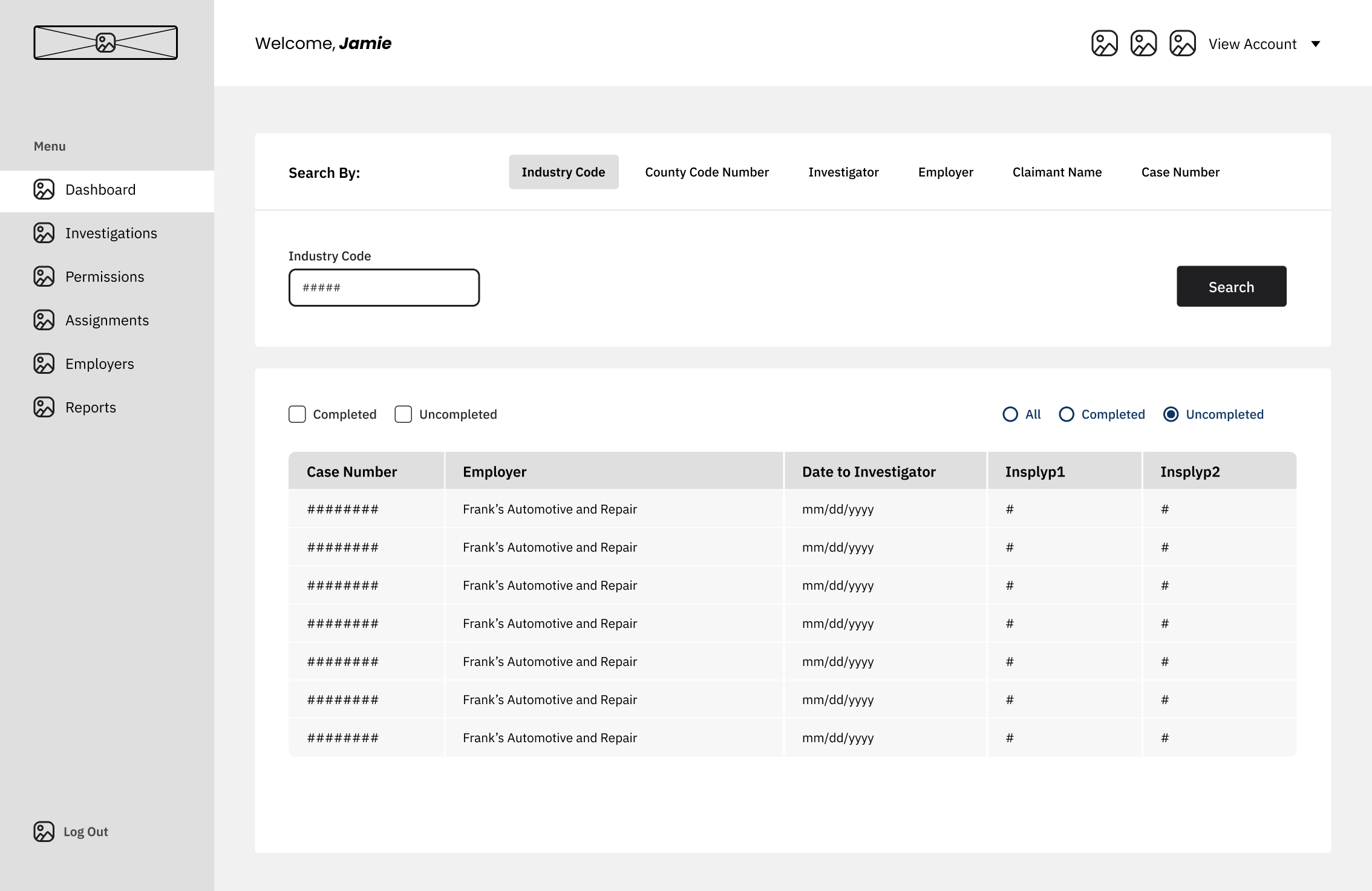
Sketching and iterating became the name of the game in finding a layout and flow that would accommodate our users' needs. After iterating, presenting, and getting more feedback on the preferred design direction, we landed on a design that I would develop into a high-fidelity prototype.
The Final Product
Delivering a Final Product that Addresses and Solves User Frustrations
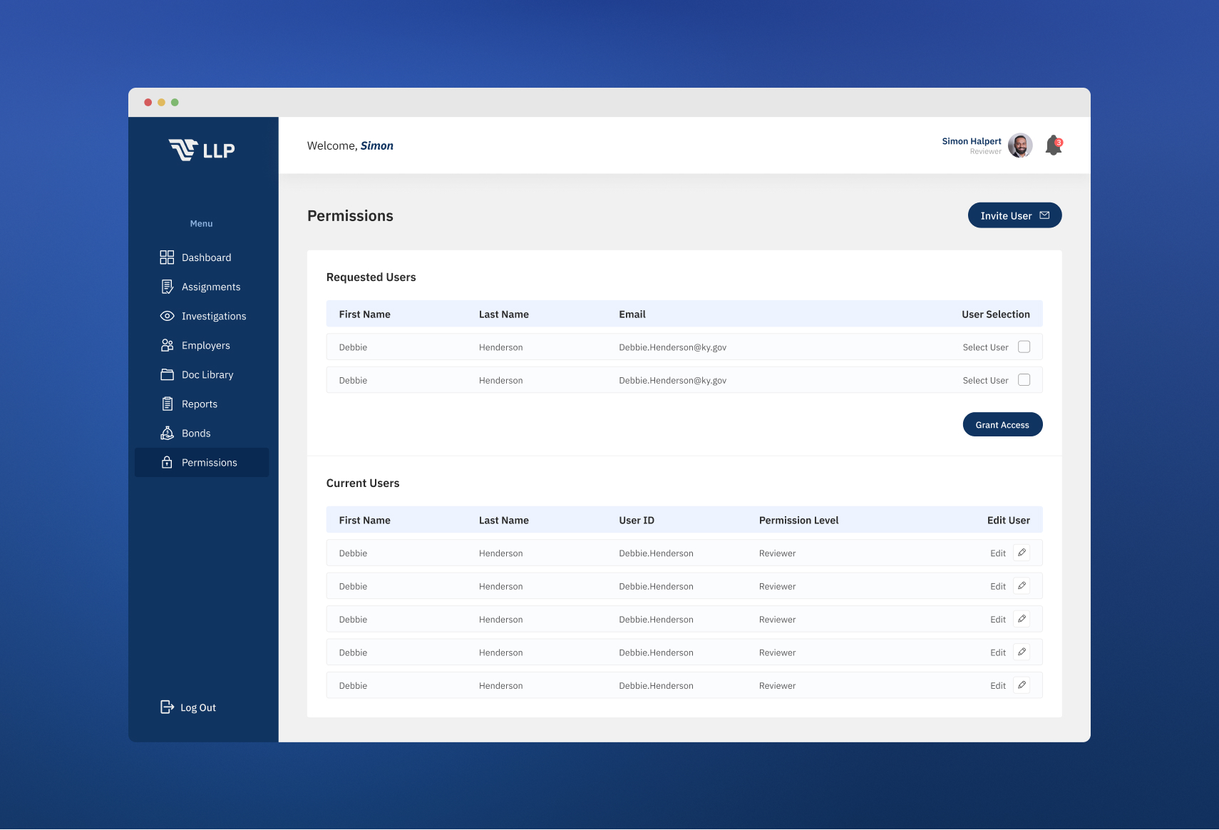
Through trial and tribulation, my team and I identified key pain points and unique design solutions by listening to our user and business needs and goals. By iterating and designing to accommodate those needs, we delivered a final product that increased the efficiency and satisfaction of our users.

Future Steps
Reflecting, Learning, and Improvising After Launch
Monitoring and Performance Analysis
To ensure we keep the application running smoothly, in the future we’d like to continue monitoring KPIs including system uptime, page load times, and error rates to help identify any bottlenecks or performance degradation.
Reflecting on areas to improve
While building the application, it became apparent that developers needed to be involved sooner in the design process. If I were to go back and do it again, having them collaborate more with me and the stakeholders would’ve helped us streamline development and understand any limitations before designing.
Feedback and Testing, Feedback and Testing
After launch, we’d like to monitor user feedback through interviews and usability testing to understand the future needs and overall satisfaction of our users.